But you guys are some of the savviest folks I know, so I am throwing this out there.
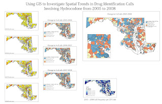
I need some help/guidance/input on developing color schemes for mapping various "phenomena" related to the Poison Center. Most maps are density maps, and the subjects are stuff like poison related deaths, number of calls for a particular substance, increase/decrease/no change over a time period, etc. I'm adding a jpg of a draft I tossed together today to just be able to "see" the data.
Now I am not completely color challenged, but pretty darn close. In the big map on the right hand side, red is for increases in calls over a 4 yr period, blue is for decreases, yellow if there was no change and then white for no calls at all over that period. It is just not a visually pleasing map. Any ideas? Any good resources for choosing colors that any of you know about?
No comments:
Post a Comment